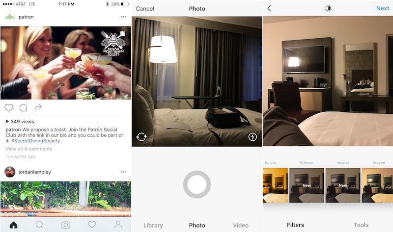
A growing number of apps are proving that when it comes to app design, less is more. In today's day and age, we have fewer gradients, shadows, and textures in apps. Instagram wants to take it one step further with their next design. They've selected a group to test their app with their redesigns. As you can see below, the layout has replaced the signature blue color of Instagram with white, along with some translucent menu bars. Whether this design does make it into the final product, that is Instagram's call.
No comments:
Post a Comment
Please keep comments constructive and don't use any foul language. Feel free to share your ideas, feedback, experiences, and more. Please know that I will read them. Thanks!